
You approved the color proof. The supplier sent photos. Everything looked right. Then your 5,000-unit order arrived, and the blue on the boxes is noticeably different from your brand blue.
Buyer question: “We sent our brand blue (Pantone 286 C) as CMYK values to our Chinese packaging supplier. They sent a digital proof, we approved it, and the bulk run came back noticeably off. What should I have asked or specified on the PO?”
Color matching is one of the most common sources of dispute between overseas buyers and Chinese packaging suppliers. It is rarely the supplier’s fault — it is usually a mismatch of expectations and communication.
Why Color Problems Happen
CMYK (4-color process) combines Cyan, Magenta, Yellow, and Black to create millions of colors. The result varies by paper type, ink density, and press settings. Pantone (spot colors) are pre-mixed specific ink colors — more precise but costlier and usually only available for higher MOQ orders.
Most Chinese suppliers quote CMYK printing by default because it is cheaper. If you expect Pantone-quality matching from CMYK values, you will be disappointed.
The China-Side Explanation
Chinese factory color management: the design file is loaded into the RIP software, the operator calibrates ink density based on the paper stock available, and a “machine proof” is run. Factory lighting (fluorescent or mixed LED) skews color perception. Photos taken with a phone add another distortion layer.
Step-by-Step: Getting the Right Color
- Specify your color system clearly. Pantone 286 C, 4-color process not acceptable. If CMYK is fine, say “CMYK values must match provided design within ΔE 3.0 tolerance.”
- Request a physical pre-production sample. Ask for a 10–20 sheet sample mailed to you before bulk production.
- Use a color reference tool. Buy a Pantone color guide. Compare directly when the sample arrives.
- Check under neutral lighting. Daylight (D65) is the standard.
- Set an acceptable tolerance. Industry standard is ΔE ≤ 3.0.
What to Ask the Supplier
“We need Pantone 286 C matching. Can your factory produce this with a spot color ink run, or only CMYK? Please confirm the MOQ impact.”
Cost Trade-offs
Pantone spot color printing typically adds ¥0.3–¥0.8 per unit and may require a higher MOQ. For a 3,000-unit order, this is ¥900–¥2,400 ($125–$330) additional.
Trade-offs and uncertainty
Pantone spot color vs CMYK: spot color adds roughly USD 0.05 to 0.15 per box and may require a higher MOQ (typically 1,000+ units per colorway). For a single-color brand box at 5,000 units, spot color is almost always worth it. For a multi-color promotional run, CMYK may be the only economic option.
Digital proof vs physical proof: a digital proof is a calibrated PDF printed on a proofing device. It is 80 to 90 percent accurate. A physical production proof on the actual paper stock and press is 95 percent accurate. The 10 percent gap is where most buyer disputes land.
Delta E tolerance: industry standard for brand color matching is Delta E under 3.0. Under 2.0 is achievable for spot color on coated stock. Above 5.0 is usually visible to the naked eye. Define the tolerance in writing, not verbally.
Viewing light: D65 daylight (6500K) is the graphic arts standard. A factory’s fluorescent-lit conference room skews warm. A buyer’s office with mixed LED lighting skews cool. Always compare proofs under the same D65 booth, not at the desk.
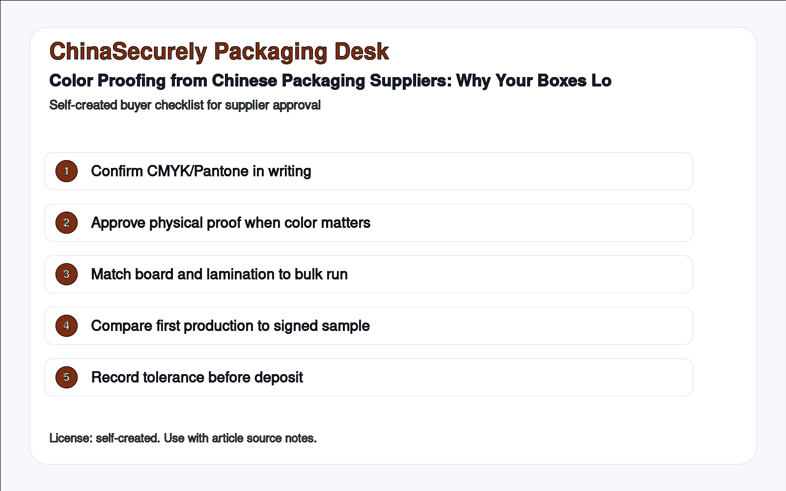
Checklist: Before Approving Color for Bulk Production
- □ Color system specified: Pantone (spot) or CMYK with tolerance stated
- □ Physical pre-production sample received and approved in writing
- □ Sample evaluated under D65 daylight or neutral light
- □ Paper stock on sample matches production paper stock confirmed
- □ ΔE tolerance agreed in writing (≤3.0 recommended)
- □ Factory confirmed they will not proceed to bulk without written approval
Need help checking a Chinese packaging supplier’s color proofing process? Send the design files and supplier quote. ChinaSecurely can help you avoid this common trap before you pay.
Updated source and visual note
This draft was updated with a self-created ChinaSecurely checklist image and public source notes. Buyer-forum access was degraded during the run, so any buyer scenario should be treated as a common demand pattern, not a direct quotation.
- https://www.qima.com/quality-control-inspections/pre-shipment-inspection
- https://www.fedex.com/content/dam/fedex/us-united-states/services/GrlPkgGuidelines_fxcom.pdf
Authoritative references (added 2026-07-22)
- Pantone Coated / Uncoated fan guide — official product page
- ISO 12647-2:2013 — Process control for the production of half-tone colour separations, proofs and production prints (offset)
- Idealliance — Standards for graphic communications, including G7 and color management
- Fogra — German graphic arts research association, color management and proofing standards
- TAPPI — Graphic arts and packaging standards (public overview)
Source access: Pantone, ISO, Idealliance, Fogra, and TAPPI pages were accessed via public web on 2026-07-22. ISO 12647-2 full text is paid; the color-matching guidance above is drawn from the public abstract and the general process control framework. For any brand-color claim on packaging, confirm with the brand’s color management team.
Source and verification notes (updated 2026-07-30)
- ISO 12647-2 — Process control for offset lithographic printing: https://www.iso.org/standard/66426.html
- ISO 3664 — Viewing conditions for graphic technology and photography: https://www.iso.org/standard/75737.html
- Pantone color systems and production tools: https://www.pantone.com/
- G7 process control and print consistency: https://www.idealliance.org/g7
A Pantone reference alone does not guarantee an identical result across coated paper, uncoated paper, lamination, ink batches, and viewing light. Buyers should approve a physical production proof under controlled lighting and define an acceptable Delta E tolerance with the printer.